
What’s worse than a bar chart? A 3D bar chart
Every chart has only one purpose: to show the truth contained in the data—and to do it as quickly as possible. And that’s precisely where the classic chart struggles.
A bar chart looks innocent: it shows a single number as the height of the bar. The problem is that a bar has two dimensions—height and width—while the data only has one. Height carries information. Width is pure decoration. In many situations, a line, a point, or simply a number would convey the exact same information faster and more clearly.
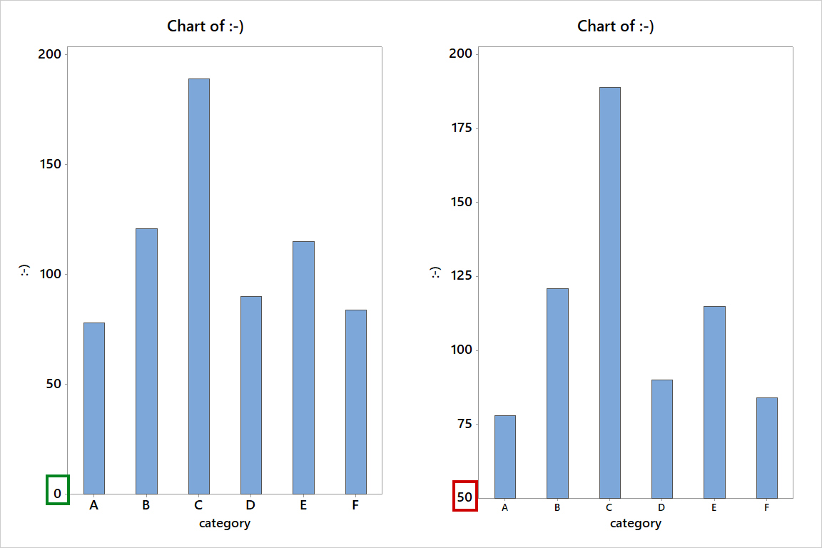
But that’s just the beginning! Bars encode values by length, and length always refers to zero.
Therefore, a bar chart must start at zero.
If the Y-axis doesn’t start at zero:
- visual differences no longer correspond to numerical differences,
- proportions between categories become distorted,
- the chart begins to tell a story that simply isn’t there in the data.
This isn’t a minor aesthetic flaw. It violates the meaning of the data.
Click to enlarge
In practice, simply shifting the bottom of the axis is enough to turn “small changes” into “dramatic increases or decreases.” Sometimes this happens unconsciously. Sometimes very consciously.
And now the 3D version—or how to make it even worse.
A bar chart is already a compromise: it hides variability, imposes length interpretations, and facilitates the creation of false stories.
The 3D version does something worse. It adds a third dimension that:
- carries no information,
- distorts perception,
- and dramatically increases the risk of erroneous conclusions.
The viewer must “straighten” the chart in their head before they can understand it. This means that the chart is neither fast, reliable, nor cognitively efficient. 3D is not “more advanced.” It is simply more misleading.
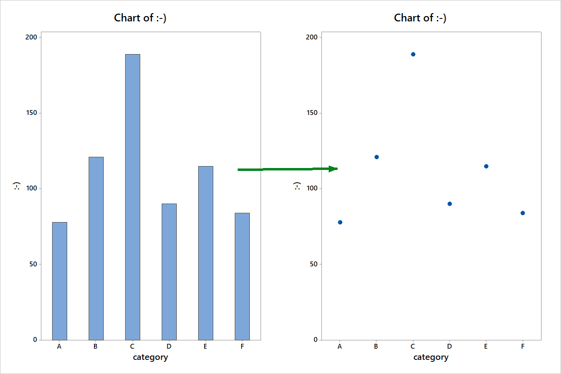
And what can be used instead of bars?
If the data has a single dimension, dots will work perfectly.
Click to enlarge
If your data also has a time history and you want to know if the process is changing, use—as Donald J. Wheeler called it—Process Behavior Charts. They’re the Maybach of charts. Instead of telling stories, they show facts: variability, stability, and real process changes.
If you have two dimensions, a boxplot will reveal more truth than any bars.
Only when the data is truly three-dimensional should you consider a 3D chart.
The visualization format should stem from the question you’re answering—not from the desire to “make it look cool.”
Data doesn’t lie. Charts often do.